

The following resource guides would be helpful for a class on DCNM (Data Center Network Manager (these are the articles/ digital material):
1. “Visualising abstract data on maps” by G. Funchs and H Schumann
This article provides an overview of map combinations, and visuals can be used to visualize abstract data with spatial connections. An extended focus & context method was given in this article to filter information to prevent overstuffing images. An incremental visual location
optimization approach was also implemented to enhance the representations further.
Numerous techniques for effectively and thoroughly visualizing complicated and heterogeneous information environments have been created recently. However, most of these methods assume that the data is abstract and lacks geographic relationships. But georeferenced, multivariate data is used in applications like multispectral satellite sensor pictures and healthcare analytics. Here, depicting this spatial frame of reference alongside the abstract data is crucial. As a result, more recent methods blend thematic maps and information representations. The need for sophisticated cartographic knowledge in information representation has been explored, for example, by Skupin.
2. “Studying the Utilization of a Map-Based Visualization with Vitality Datasets” by Domain Experts
This paper offers a comprehensive look into the findings of a mixed-methods research examining how a map-based depiction with diverse vitality data helps the visual analysis process among various topic specialists. The study supported the preference for map-based among those subject-matter specialists and several advantages, including the effectiveness of the data display and the simplicity of spatial
analysis. Due to its complex and exacting requirements, it also encountered difficulties when subject specialists used it in the real world for tasks. Although the adaptability of map-based data visualization for various target groups has already been considered, more thought is still required to support the work of subject specialists in the real world.
Using themes developed by combining multiple datasets and displayed collectively in map-based data representations may aid in covering each particular use case among different subject specialists. These themes can be realized by interface and feature designs considering these adaptations. Using themes developed by combining multiple datasets and displayed collectively in map-based data representations may aid in covering each particular use case among different subject specialists. These themes can be realized by interface and feature designs considering these adaptations.
3. “Mapping and Visualization Softwares tools: a review” by Dr. S L Sangam.
This paper explores the current article’s goal to emphasize the value of mapping and rendering software tools, specifically Bibexcel, CiteSpaceII, CoPalRed, IN-SPIRE, Leydesdorff’s Software, Network Workbench Tool, Sci2 Tool, Vantage Point, and VOS Viewer. It also discusses software frameworks, how to use them, and how operations work.
These open-source programs exhibit various qualities following the demands of the scientometrics paradigm. Examples include growth models, scientific productivity models, author networks, author institutions, author nations, author grants, subject category co-occurrences, co-words, and models for documents’ bibliographic coupling obsolescence.
Additionally, the software can create networks over time to analyze the evolutionary trend of the area chosen for study. A thorough analysis of a particular field of science should be made using various software tools, bringing all the necessary information and viewpoints together. Each graphic has a unique set of views that can be produced and these views aid in interpreting and analyzing the outcome.
4. “The invisible heartbeat of New York City” by Justin Fung (Article: 10 examples of interactive map data visualization)
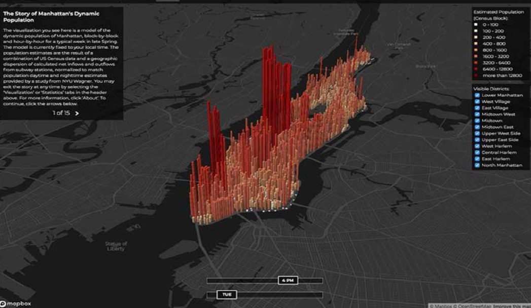
Using information from the 2010 Census, the MTA’s turnstile database, and an earlier NYU study, data viz artist and scholar Justin Fung created an animated map that depicts the mini-migration over a single day. The population of Manhattan was estimated block by block by Justin, and the map’s representation of hourly changes throughout the week mirrored these figures. The skyscraper-like bars show the population of a particular block, and dark-red hues denote places with more prominent people, such as Midtown and the Financial District.
Work Cited:
1. Funches, G., & Schumann, H. Visualising abstract data on maps.
2. Domain Experts [Anonymous]. Studying the Utilization of a Map-Based Visualization with Vitality Datasets.
3. Sangam, S. Mapping and Visualization Softwares tools: a review.
4. Domain Experts [Anonymous]. Ten examples of interactive map data visualization. [Fung, J. The invisible heartbeat of New York City.]
Recent Comments